
OAKLEY
Graphic Design
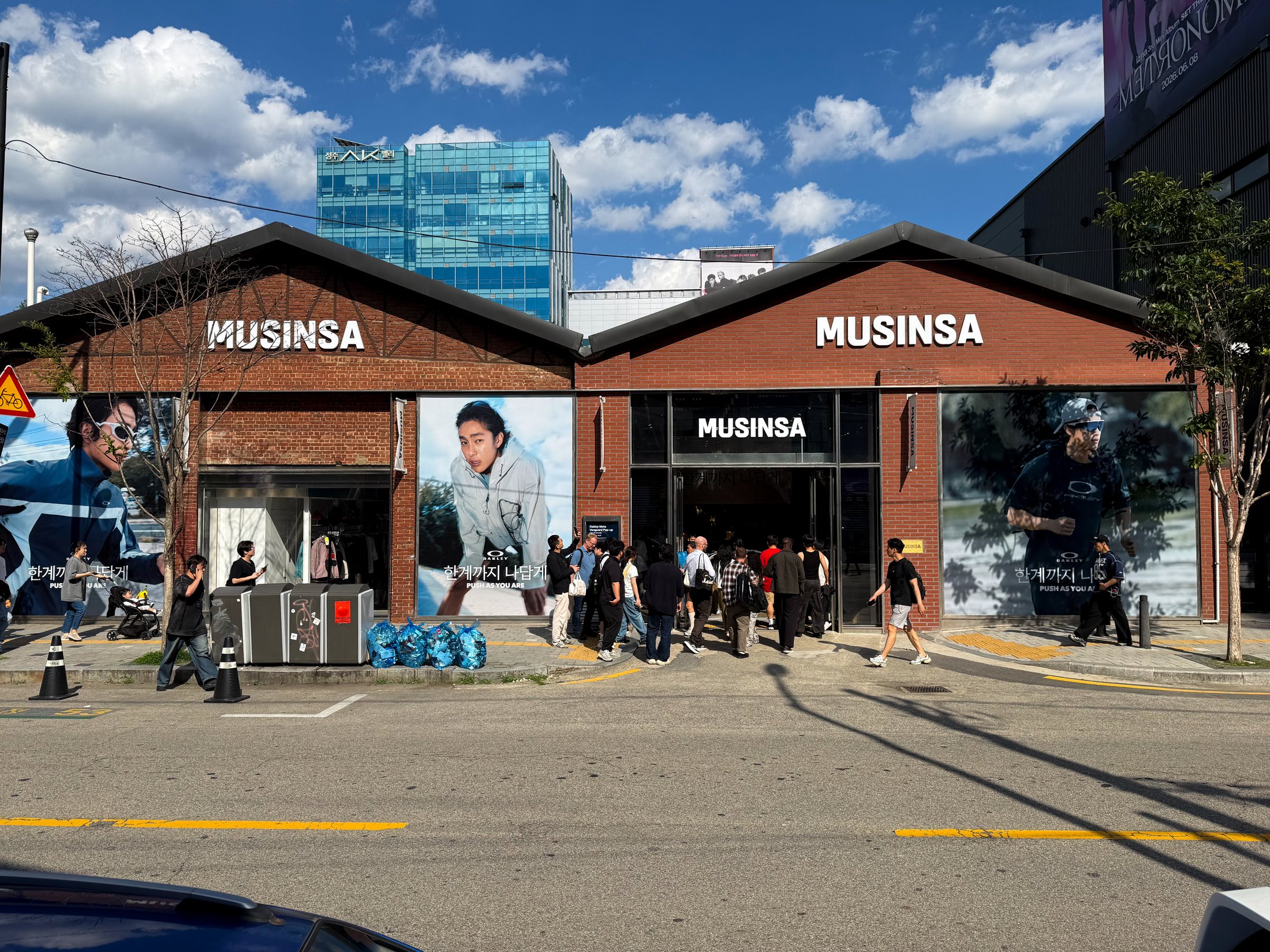
Oakley's entry into the Korean market was a milestone for the brand. It marked the first time Oakley had officially launched and marketed in Korea, which meant there was no existing Korean brand language to reference or build from. Everything visual had to be established from the ground up within their global brand guidelines.
I joined the project as a graphic designer through Underbridge, the agency that partnered with Oakley on the campaign. Working with photography provided by the Underbridge team, my role was to translate Oakley's visual identity into the Korean market context, selecting the appropriate typefaces from their brand system and applying them to a market that had never seen Oakley communicate this way before. Every design decision carried the weight of setting a precedent.