OAKLEY

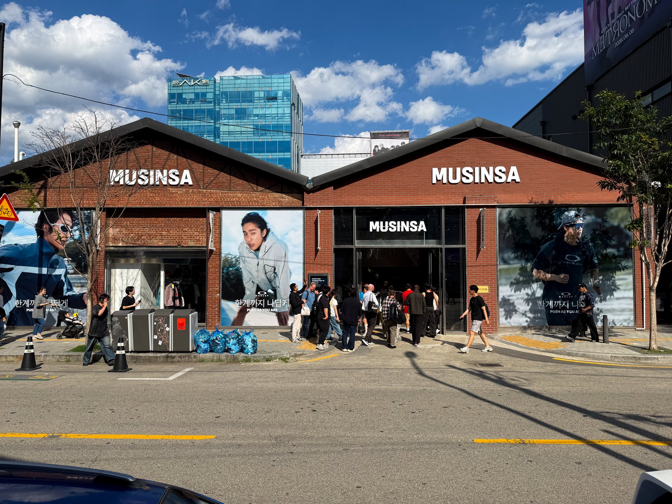
Oakley campaign visuals on the Musinsa storefront in Seoul

Graphic Design

Oakley's entry into the Korean market was a milestone for the brand. It marked the first time Oakley had officially launched and marketed in Korea, which meant there was no existing Korean brand language to reference or build from. Everything visual had to be established from the ground up within their global brand guidelines. Working with photography provided by the Underbridge team, the role was to translate Oakley's visual identity into a market that had never seen the brand communicate this way before.
Routine Coffee

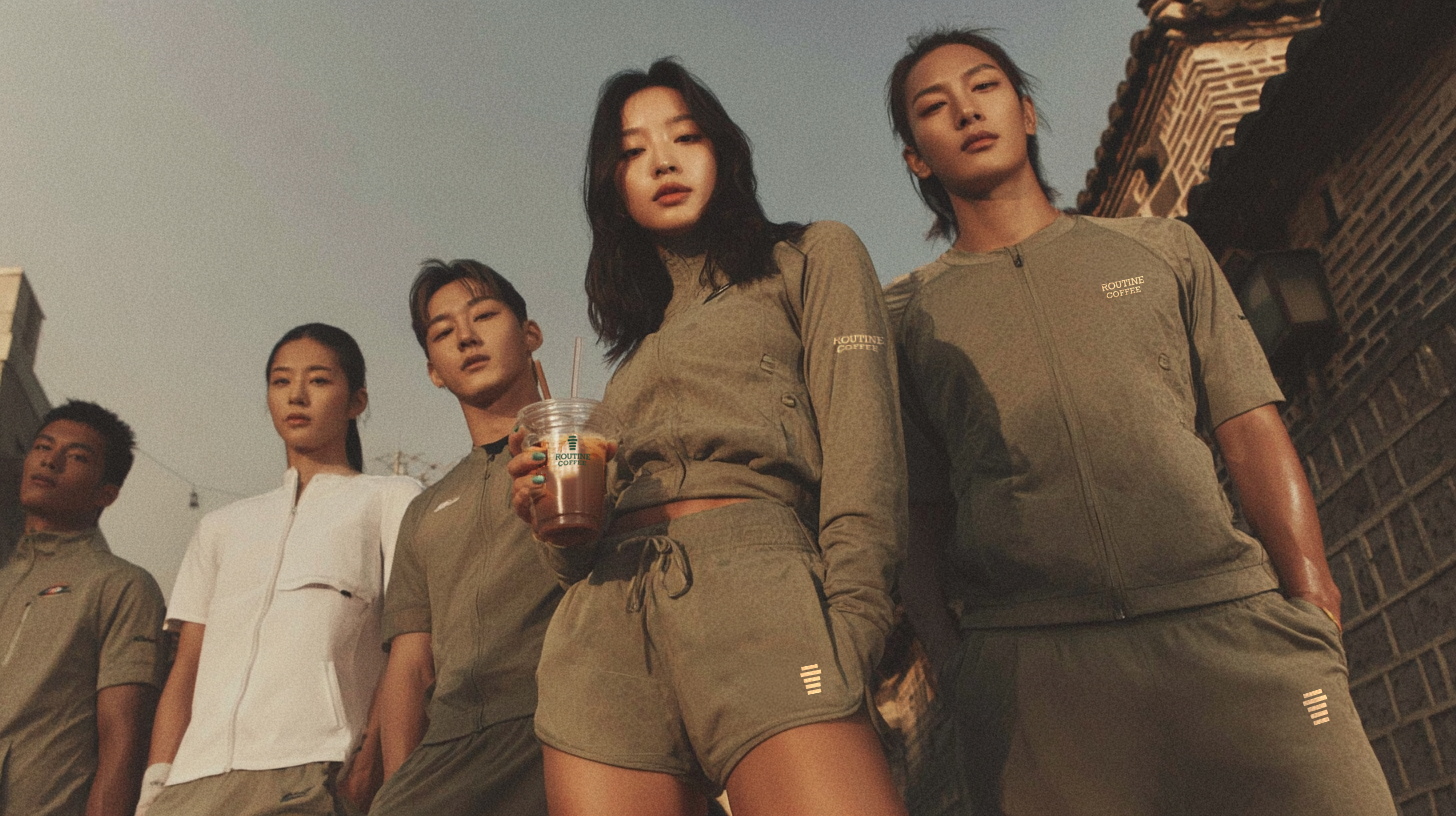
Routine Coffee campaign photography

Creative Director | Marketing Director

Routine Coffee is a Seoul-based coffee brand built around the active and forward-thinking lifestyle. In a market where budget coffee had grown fast but forgotten the person drinking it, the brand was built to offer the same accessibility at a completely different level of intention. As creative and marketing director, the work spans the full brand experience, from visual identity and spatial design to content strategy, campaign direction, and the brand deck that frames Routine Coffee's story to investors and franchise partners.

Genieya

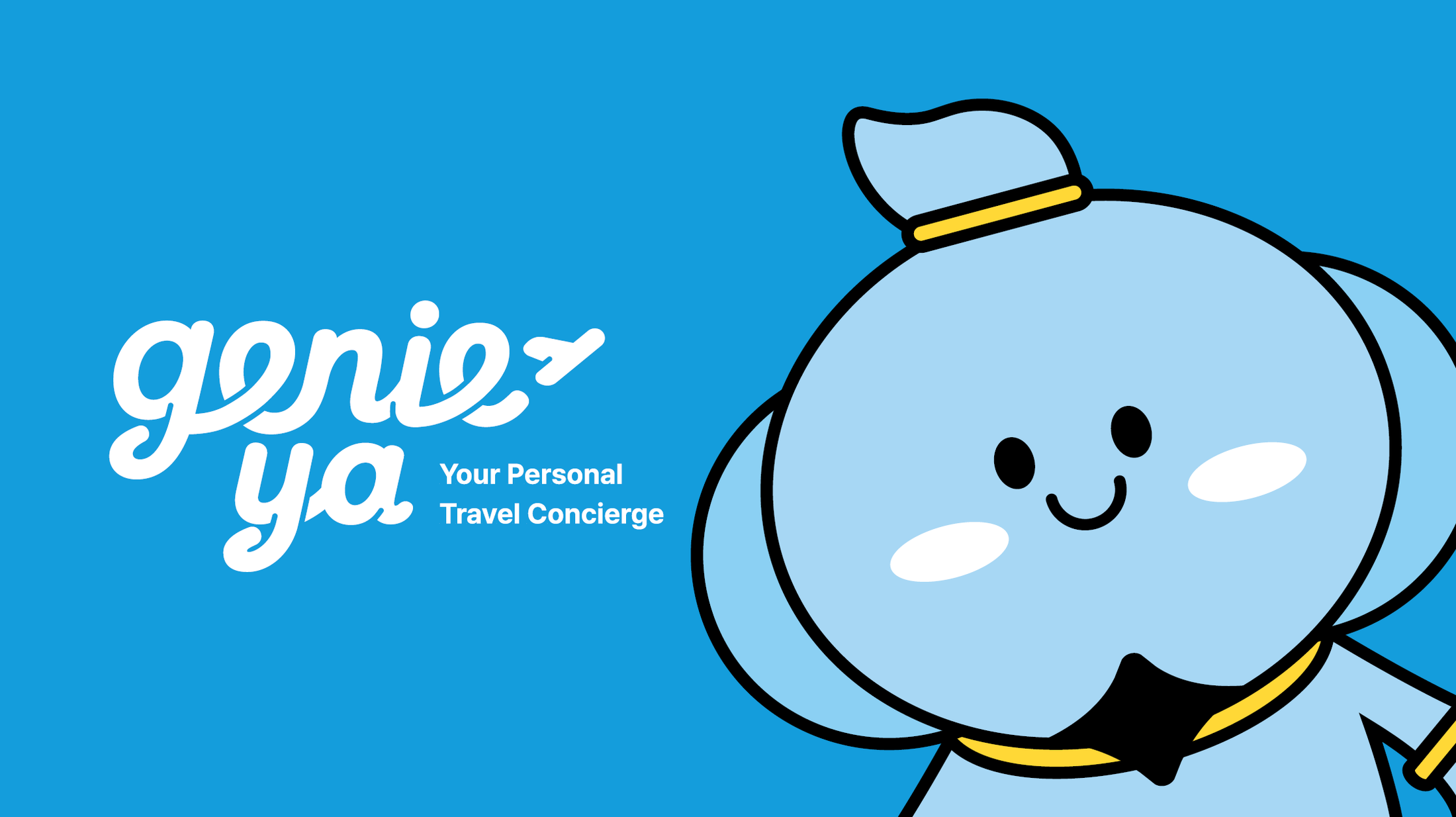
Genieya travel concierge app branding

Brand & Marketing Consultation

Genieya is a travel concierge app developed through a partnership between T&M Tour and ELUO, built to reimagine how people plan and experience travel. Working as a brand and marketing consultant for T&M Tour, the role covered brand direction, marketing strategy, influencer and partnership framework, multilingual outreach materials, and UI/UX consultation to ensure the product experience aligned with the brand without friction. The focus throughout was making sure every decision was moving the company in the right direction for sustainable growth.

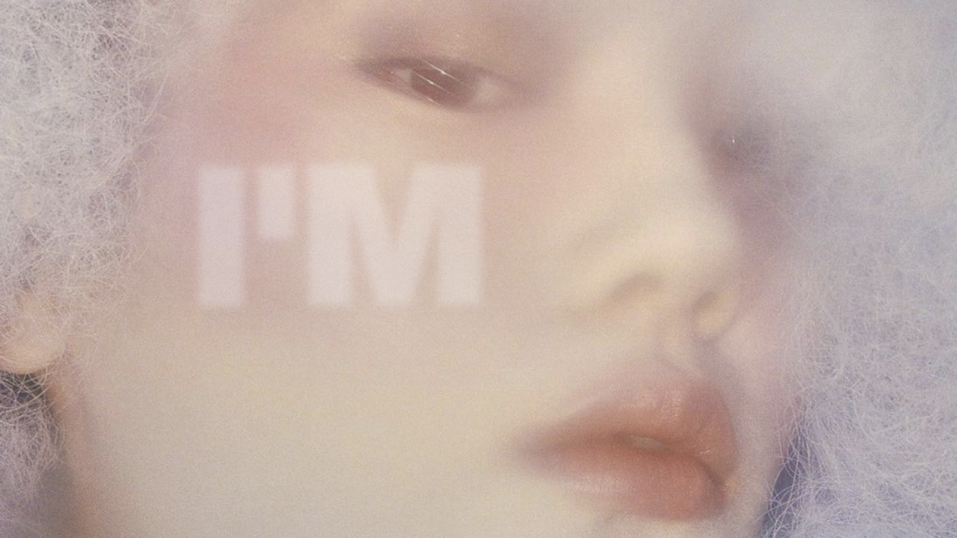
I'M

I'M record label brand identity

Brand Identity | Brand Strategy | Spatial Design

I'M is a record label built around the mixed culture of underground R&B, hip-hop, and drill coming out of Seoul and London, two cities that share a restless, layered energy that doesn't fit neatly into mainstream categories. Through research and brand strategy, a cohesive brand identity was developed alongside marketing materials and a spatial experience designed as a lounge and festival venue, giving visitors a way to experience the brand through all five senses. The marketing strategy was visualized within Seoul's Coex district, using digital panels to show how the brand could live dynamically in the city.

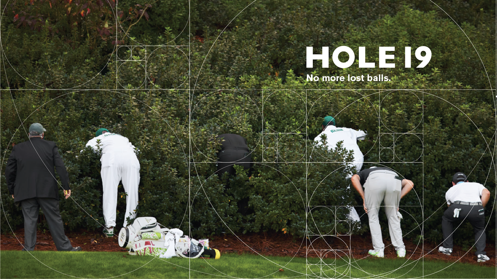
HOLE19

Hole19 rebrand

Brand Identity | Brand Strategy | Product Design

The golf GPS tracking app market had matured without really evolving. Most apps could tell you where you were on the course, but none were using technology to actually improve how an athlete thinks or plays. The rebrand of Hole19 explores what happens when you push that further, integrating technologies like Neuralink and Trackman into a brand and product experience built for performance. The project covers a new brand identity, marketing strategy, and a vision for how golf can expand into gaming, virtual reality, and the metaverse.

Matrix

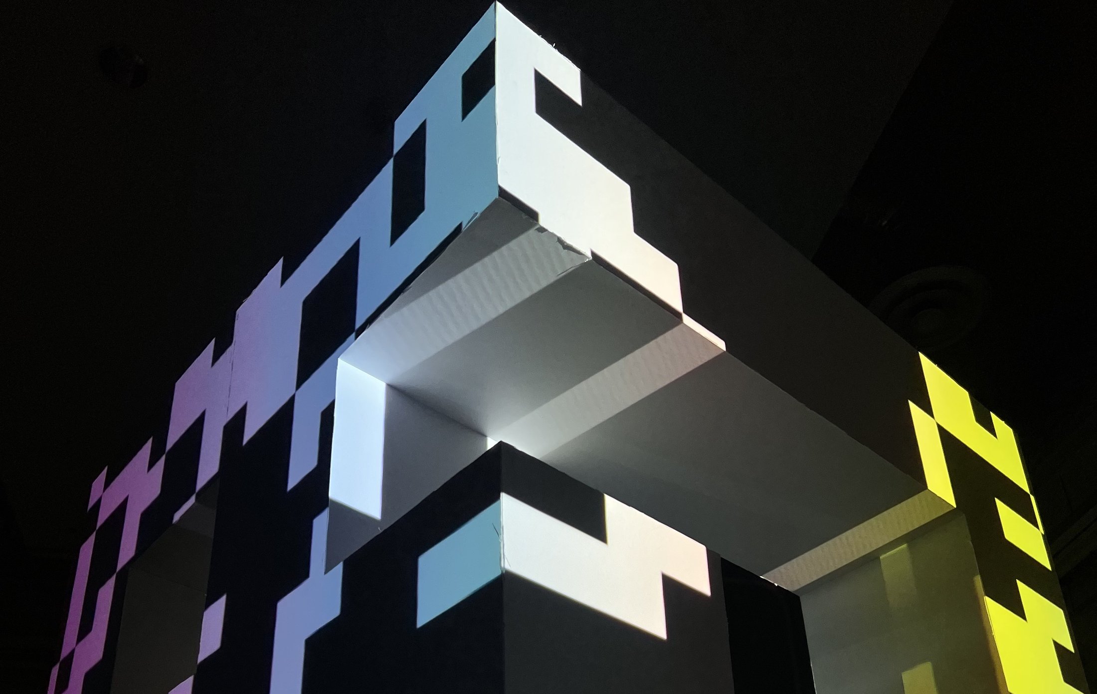
Matrix generative typography

Typography Design | Spatial Design

Inspired by John Conway's Game of Life, this typeface was designed to live and die on its own terms. Letterforms built on cellular logic, where neighborhoods of cells create form the same way Conway's algorithm creates and destroys life through proximity and pattern. The typeface was then coded in Processing to animate independently, with toggles for position and color built in. The conceptual installation extends the same logic into physical space, a form made of cells that itself becomes a cell.